Those of you lucky folks who subscribe to Uppercase Magazine should be receiving issue 8 in your mailbox along with your daily quotient of credit card applications and discount coupons.
Inside will be one printed piece of letterpress ephemera from a variety of wildly talented and gifted folks. We're happy to say that we some how managed to sneak in with a few of our own pieces.
So those of you really lucky folks who sit in traffic without honking, carry groceries for old folks, don't squish spiders in the house, and do numerous unrequited good deeds daily, run to your mailbox! Quick! Today may be the day it all pays off with you being the proud owner of a snazzy new Product Superior card or print.
A special thanks to Uppercase for our inclusion and a great issue!
Tuesday, March 22, 2011
Jessica Define Custom Wedding invitations
We here at Product Superior like custom stuff. Shoes made to size, bike frames in any color we want, cheeseburgers with two pickles instead of one and mustard but not ketchup. In keeping with this, custom wedding invitations pretty much blow our mind.
Enter Jessica Define. Houston based designer, blogger, and most importantly in this case bride to be. She wanted a retro inspired wedding set that would be fun, classy, and appeal to both her and her fiance Steven. We were tasked with finding a solution that would meld their interests such as classic american muscle cars, mid-century design, high fashion, and rap music together in a way as compelling and interesting as they are as a couple.
We threw everything we had into the mix. Based on a few photos and the wonderful content written by the bride we whipped up some custom illustrations for use throughout the offset printed "informational poster" and rehearsal card. Fancy invitations call for some fancy printing and this is no exception. We went with letter pressed metallic gold ink on Crane's cotton paper. To top it all off we sourced out some custom gold foil stamped black ribbon.
We were thrilled with the results. More importantly we got the opportunity to make Jessica and Steven's big day just a wee bit bigger. Thanks again!
Labels:
custom design,
letterpress,
wedding
Wednesday, January 12, 2011
Aaron and Rachel - Custom Holiday Card
The Holidays. We all have a brother, sister, or cousin far more successful than we are. You pull up in your 2006 Honda Accord, your mom's brother's son Jeremy arrives in a five series BMW so new it still has those little rubber hairs on the tires. Uggh.
Well guess what- no one in Aaron and Rachel Tharpe's family cared about Jeremy's new BMW this year. The talk around the turkey was this festive number that we custom designed to send so much holiday cheer that it hurt.
We took inspiration from classic holiday stories, vintage wrapping paper and gave it a personal twist. The Tharpes chose letterpress printing and Workhorse Printmakers came through with a beautifully printed two color metallic card on Crane's Lettra with matching envelope.
They loved the results, we loved the results. Jeremy was bummed that no one cared about his satellite radio.
Labels:
custom design,
holiday,
holidays,
illustration
Wednesday, May 26, 2010
Paint it Black
For those of you riveted to your seats awaiting continued coverage our printing equipment prepare yourselves. Second, but by no means second best comes our old style Chandler and Price 8x12.
The serial number of this press places it somewhere around late 1896 as the date of manufacture. We obtained the press through sheer chance. We happened to find a gentleman in St Louis selling the press condition unknown but willing to deliver to Houston. After exchanging some pictures and emails the press arrived, intact, and in far better shape then expected Thanksgiving weekend of last year. Mechanically all seemed well with little play in the linkages , little rust, and freely spinning operation. The catch, and there always is one, is that the press was coated solid with a quarter inch of what appeared to be waxy, congealed grease (photos below courtesy of seller, prior to delivery).
We cleaned. We scrubbed. The waxy grease came off. So did the paint. And cast iron oxidizes fast when exposed to the atmosphere. Real fast.
History is paved with otherwise level headed individuals who achieve acts of greatness through moments of blinding obliviousness and sheer idiocy. Sure, why can't we sail around the world? A flying jump kick through a flaming hoop- no problem! Our moment would be where I uttered the phrase "We're going to have to disassemble and repaint the press". Idiocy indeed. The wrenches and wire wheels came out, fingers were smooshed and blackened, and I spent a month looking like a coal miner in some kind of new age Dickens play. The work was akin to a vacation stay in the seventh ring of hell. Wire wheel all the gunk off a part. Take a break. Return to find that you hadn't wire wheeled all the gunk off the part. Repeat.
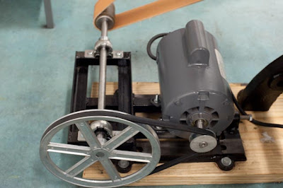
Eventually success was achieved. Black and red paint were applied as befitting any badass machine. I cut and finished new feed and delivery tables. But we had no power. The original motor was toast so we needed a new motor and a way to mount it. After some deliberation we decided to purchase a cheap and readily available 1725 rpm 1/2 HP 110 AC motor and reduce the speed through a belt drive system so that it was appropriately safe for hand feeding. The final speed is about twenty impressions per minute which gives plenty of time to put paper in and get hands out safely. We fabricated the motor mount using bearings and angle iron sourced from Mc Master Carr industrial.
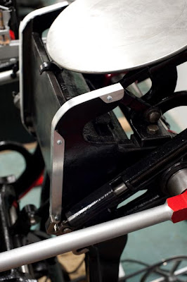
Another issue with the press was the rails that the ink rollers ride on. Older presses tend to generate waves and dips in their rails through normal wear and tear which can lead to uneven plate inking. This was the case for our press. Luckily old style Chandler and Prices have roller rails that are under type high. In short, we had room to face the rails with material and still ink our plate correctly. I chose to fabricate some adjustable rails using aluminum angle bracket. It repaired the waves in the rails and allowed us to make minute adjustments to roller height if needed. You can see the results in the below photo- the strips with the three visible screws are the roller rails.
The end result of all the toil is a press that runs almost silently and vibration free and looks stunning to boot. A special thanks to our good friends Chris and Zach for some welding and CNC machining of some crucial replacement parts.
And now- a video!
Labels:
hold on and hope for the best,
letterpress,
news,
workspace
Tuesday, May 25, 2010
12x18 Chandler and Price Craftsman AKA The Beast.
Howdy, hi there, hello! For those of you keeping score we've been pretty busy with a new office space, the Renegade Craft Fair in Austin and most importantly some new to us printing equipment.
Weighing in a few pounds shy of a Chevrolet Camaro and able to frighten the most steadfast of men, let me introduce our 12x18 Chandler and Price Craftsman press. Serial numbers date the press to late 1928 and although it was running pretty good upon purchase it was beginning to show its age. We've taken an as-thorough-as-practical approach to cleaning and refurbishing focusing mainly on preventative maintenance and repairs.
The most pressing issue we had was the degradation of the main shaft bushings on the driven side of the press. When running the shaft had approximately one quarter of an inch of freeplay to wobble around which had led to some fairly gnarly damage to the press's gear drive. Additionally it made the ground vibrate with a pounding bang so loud that it caused most individuals to flee from the room in alarm. After some careful measurements and a delivery from Mc Master Carr industrial we're back in action with a newly pressed in self lubricating bronze bushing.
We've spent countless more hours cleaning grease and goo, replacing hoses and fasteners, and locating replacement parts. There's still much more work to be done, but for now a preview of the payoff- a quick video of the press in action.
Labels:
hold on and hope for the best,
news,
workspace
Tuesday, May 11, 2010
Renegade Craft Fair Austin!
Don't forget to come check out the Renegade Craft Fair in Austin, Texas this weekend, May 15 & 16! We're so thrilled to be a part of the first one here and even more so to be amongst all the other great designers and crafters.
Here are a few I'm especially looking forward to:
The Decoder Ring (I hope to find some kicking posters for my studio walls)
Folded Pigs repurposed restaurant ware
Campfire T-shirts
Moxie Doll stitchings
Loyalty & Blood Along with missing our friends Dave & Maggie, I've also been waiting on this cave shirt, and am really loving the handyman tool earrings!
It's bound to be a great weekend in Austin and hope you can make it!
Monday, April 26, 2010
Product Superior included in "Impressive" book by Gestalten
Available for purchase today, Impressive is a book we're very pleased to be included in by Gestalten - the awesome publisher of all things relating to visual culture.
In brief, the book covers: "Today’s fascination with old-fashioned printing presses and techniques started with individual designers and smaller collectives that created one-of-a-kind printed material by hand for special occasions, such as weddings or birthdays. Impressive features these artists and their personal work as well as a broad range of business cards, invitations, stationery, and publications that are designed and produced in a way that is both nostalgic and contemporary." Read more from their site and take a peek at some of the interior spreads - or just cut to the chase and buy the book here!
Correction: you can buy in the US from here.
photo courtesy Gestalten
Labels:
books,
design,
letterpress,
news
Subscribe to:
Posts (Atom)